Sometimes I try multiple versions of a shot, and can’t decide which I like best. This is one of those cases. Three takes. Opinions?

Pink+Blue
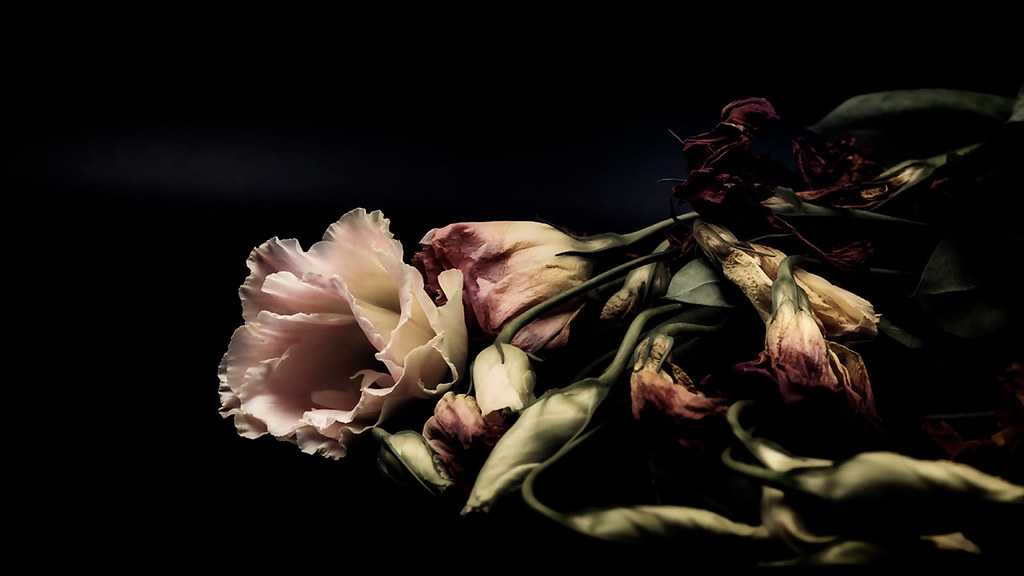
Antique
Vibrant
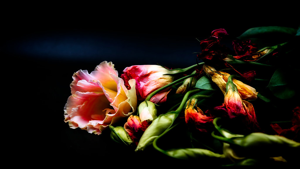
Sometimes I try multiple versions of a shot, and can’t decide which I like best. This is one of those cases. Three takes. Opinions?
Pink+Blue
Antique
Vibrant

I like the first one. It’s the most real colors, and that bothers me. But without a reason for there being a strange turn to one of the others, it just seems like a cheap trick to gain people’s interest. There sometimes is a reason we expect the colors there, and the true colors are there in your first sample.
LikeLiked by 1 person
I like the first one, too. But here’s the odd thing. The third one is actually closest to the original in color. It’s a little intensified, yes, but it’s the first one that is muted. The pink and blue effect is the result of a filter I used just experimenting. Ain’t technology grand?
LikeLiked by 1 person
I thought the first until I saw the last.
LikeLiked by 1 person
And I’m SUCH a fool for bright colors….
LikeLiked by 2 people
While I like the pink and blue version the most, It’s really what impression you want to leave. If you are trying for a pale, faded image, or what seems like an overly vibrant image, then the others change the mood. Regardless of the information that the last shot was closest to the original colors, it seemed the least likely of the three to be a natural look, due to the extra intensity.
LikeLiked by 1 person