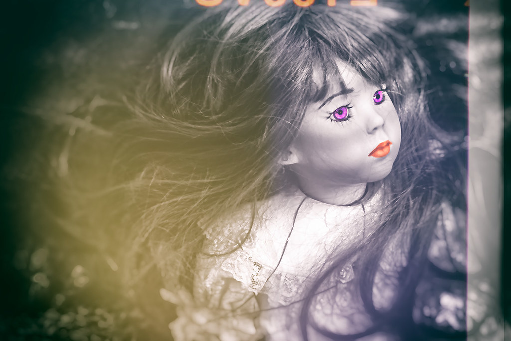
Vintage Doll…
Four takes.
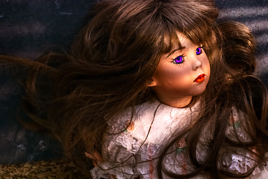
Color

Select Color

Select Color – Distressed
Classic Proof
Share this:
- Share on Facebook (Opens in new window) Facebook
- Share on Bluesky (Opens in new window) Bluesky
- Share on Mastodon (Opens in new window) Mastodon
- Email a link to a friend (Opens in new window) Email
- More
- Share on Threads (Opens in new window) Threads
- Share on Tumblr (Opens in new window) Tumblr
- Share on Telegram (Opens in new window) Telegram
- Share on WhatsApp (Opens in new window) WhatsApp
- Share on LinkedIn (Opens in new window) LinkedIn
- Share on Pinterest (Opens in new window) Pinterest
- Share on Nextdoor (Opens in new window) Nextdoor
- Share on X (Opens in new window) X
- Share on X (Opens in new window) X
- Share on Reddit (Opens in new window) Reddit
- Print (Opens in new window) Print

I vote for No. 2. It conveys a stark reality with a touch of humanity in the color. And, of course, it’s frighteningly creepy. Good work.
LikeLike
And you’ve never indicated much interest in select color, either.
This is another case where processing decisions just change everything, I think. One and four tell a story about glamour. The other two not so much. Just a question of what story you’re trying to tell, I suppose.
LikeLike