I wouldn’t have believed this would work at all, but I kinda like it.
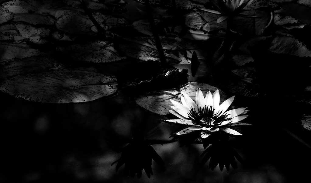
Water Lilies
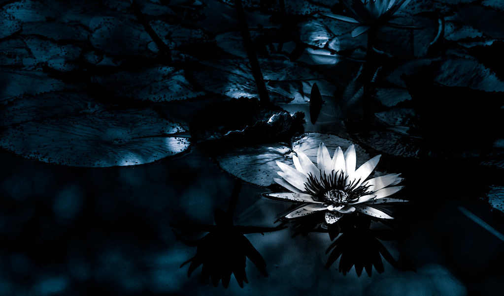
Water Lilies
Share this:
- Share on Facebook (Opens in new window) Facebook
- Share on Bluesky (Opens in new window) Bluesky
- Share on Mastodon (Opens in new window) Mastodon
- Email a link to a friend (Opens in new window) Email
- More
- Share on Threads (Opens in new window) Threads
- Share on Tumblr (Opens in new window) Tumblr
- Share on Telegram (Opens in new window) Telegram
- Share on WhatsApp (Opens in new window) WhatsApp
- Share on LinkedIn (Opens in new window) LinkedIn
- Share on Pinterest (Opens in new window) Pinterest
- Share on Nextdoor (Opens in new window) Nextdoor
- Share on X (Opens in new window) X
- Share on X (Opens in new window) X
- Share on Reddit (Opens in new window) Reddit
- Print (Opens in new window) Print

Go with B&W, it carries the look of the professional. The blue just looks like a mistake (harsh, sorry, but it’s how I see it).
LikeLike
Striking side to side – love both!
LikeLike
I do like the pure B/W better than the faux-cyanotype. I like the color better than both, though. Still, there’s a certain dignity about the B/W. And I discovered the look because I pushed the wrong button processing… 🙂
LikeLike