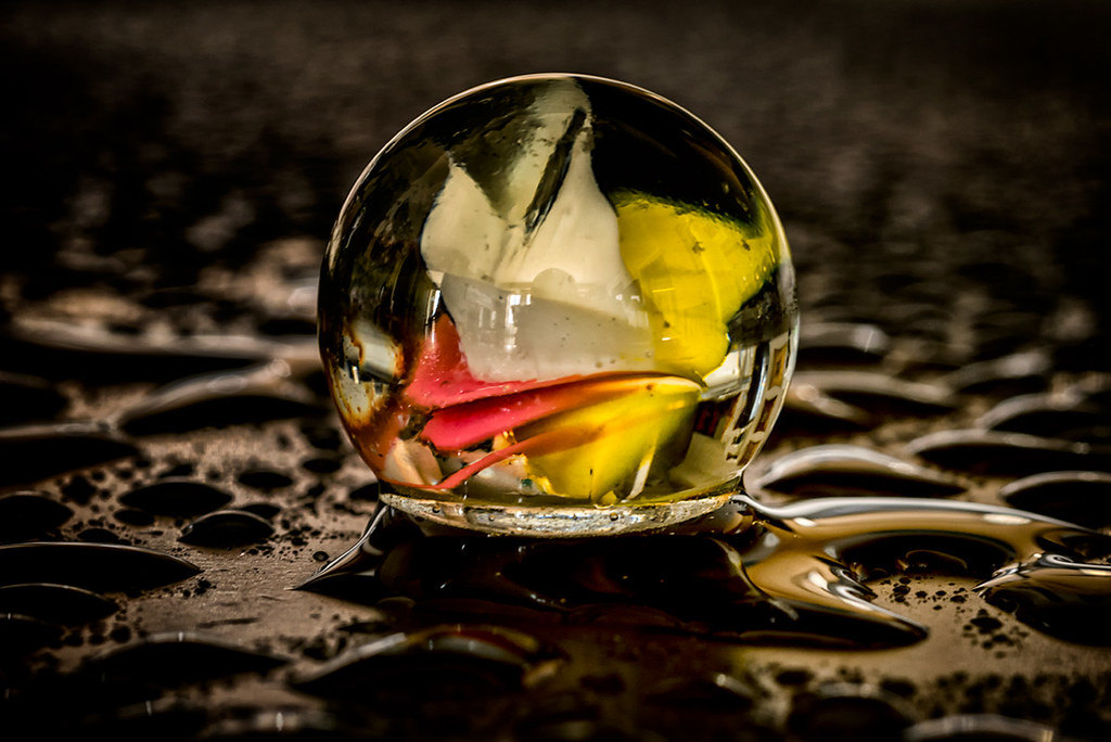
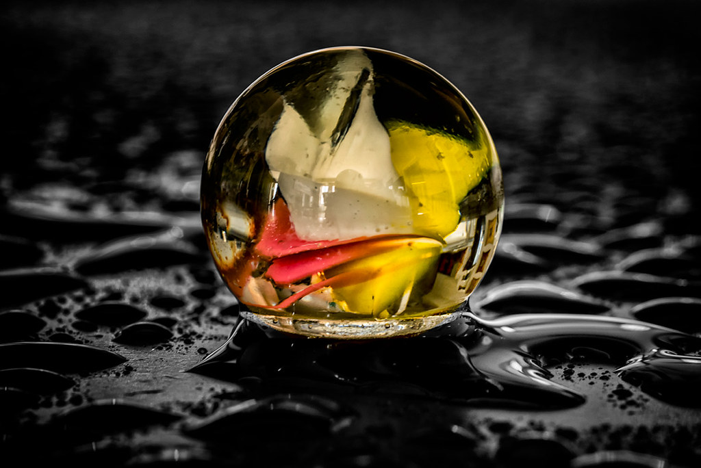
Two versions. What do you think?

Color process

Select color
Share this:
- Share on Facebook (Opens in new window) Facebook
- Share on Bluesky (Opens in new window) Bluesky
- Share on Mastodon (Opens in new window) Mastodon
- Email a link to a friend (Opens in new window) Email
- More
- Share on Threads (Opens in new window) Threads
- Share on Tumblr (Opens in new window) Tumblr
- Share on Telegram (Opens in new window) Telegram
- Share on WhatsApp (Opens in new window) WhatsApp
- Share on LinkedIn (Opens in new window) LinkedIn
- Share on Pinterest (Opens in new window) Pinterest
- Share on Nextdoor (Opens in new window) Nextdoor
- Share on X (Opens in new window) X
- Share on X (Opens in new window) X
- Share on Reddit (Opens in new window) Reddit
- Print (Opens in new window) Print
I’ll take the top. The surround is more complementary to the marble.
LikeLike
I think Denny’s hit it right. The entire upper image appears as a “whole” piece. Very good for establishing a pleasing atmosphere in a space. However, if you’re going up in a gallery and you want the piece to stand out, the second one with the B&W background is the better choice. So, once again … your purpose decides which is better.
LikeLiked by 1 person