This is a shot I tool in late 2013 when I lived in Seattle. The original process used HDR, which I have always thought made it a little noisy. Today I reworked it for a contest. See what you think. (Original follows.)
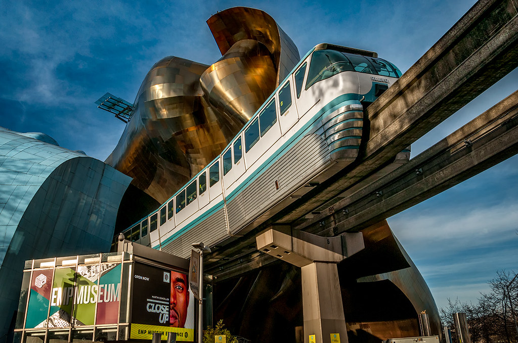
Monorail, EMP Museum, Seattle

This is a shot I tool in late 2013 when I lived in Seattle. The original process used HDR, which I have always thought made it a little noisy. Today I reworked it for a contest. See what you think. (Original follows.)
Monorail, EMP Museum, Seattle

Your rework is magnificent, Sam. Thanks for sharing it. [Is there any information, bottom dead-center, just to the right of the “Close Up” sign that is useful?
LikeLike
Actually, a little. I ought to lighten it up a bit.
LikeLike
Apologies … my monitor seems to darken things as they roll up-screen. I see the info in the HDR-toned bottom piece, but missed it entirely in the new treatment. I can see it’s there when I position it properly on my monitor.
LikeLike
I’ve always like this picture and consider one of your best. The rework improves on the original — but only in the eyes of the viewers’ tastes. The color is richer, more complete, and more engaging. But its mood is dramatically different from the original — which is stark and foreboding. As you’ve said of some of my images (looking at both color and monochromatic versions), reaction depends on what the artist is sending colored by that the audience is receiving (and the frame of mind of that process).
There. Don’t I sound smart, now?
LikeLike
Yeah, and I wrestle with that tone thing all the time. My personal preference LOVES dark and foreboding, but it has been suggesting that may not be optimal for the buying public. Who the hell knows. Maybe I’ll get lucky and the judges will like this take.
LikeLike